


DESIGN 209 Fundamentals of Typography
Project 5: "Word/Meaning"
Instructors: Annabelle Gould & Franklin Vandiver
---
The goal for this project is to explore the relationship between form and meaning through the study of typographic compositions by examining differences and similarities in typefaces and their respective letterforms. The project is structured into 2 parts: print and animation.
[ Inspired by Word as Image by Ji Lee ]
BRAINSTORMING
To begin this project, I first researched the definition of the word I was given which was "enlarge." Enlarge is mainly defined as an action verb; to make something bigger or more extensive. I also gathered a mind map of existing synonyms of the word, such as extend, grow, amplify, magnify. thicken, widen, etc. Doodles were quickly sketched to brainstorm potential visuals that were inspired from my initial notes.

Original quick doodles and notes on graphically representing the word "enlarge"
TRANSLATING SKETCHES ON SCREEN
Moving forward, I attempted to digitally translate these ideas on screen, experimenting with different kinds of typefaces with weight and style changes to explore the variety of definitions found on the dictionary. Some were based on relating letterforms to icon imagery like the zoom in sign, another manipulates the letterform to construct a frame around a word, and some combined different shape elements and sizes relating to other letters within the word.
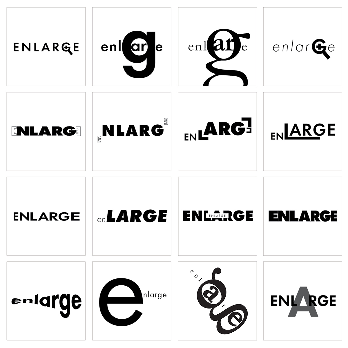
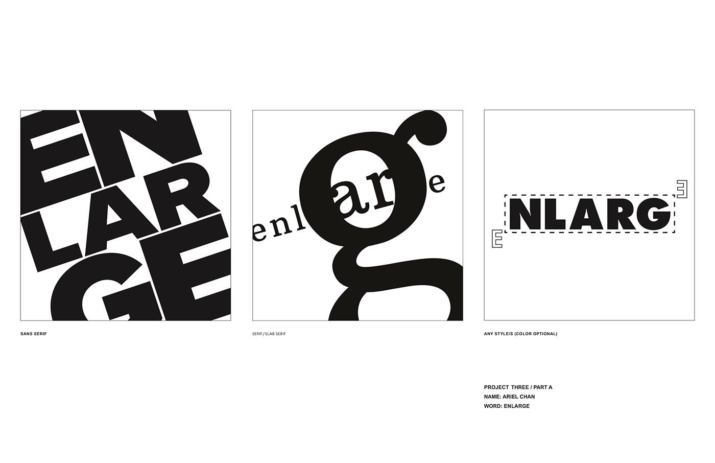
PART A: Print
For the first part of the project, we were instructed to create three distinct compositions ranging in sans serif, serif/slab serif, and any style. Each solution should utilize only a single typeface with multiple weight or style changes within a type family. Approaching this project, I iterated on various designs from my initial brainstorm sketches and refined them into three main compositions. The first concept envisions the action verb of "enlarge" by utilizing the dynamic principle of cropping to illustrate the expansion and maximization of space. The second composition is a clever play with the lowercase "g" to resemble a magnifying glass, enlarging in a macro scale. The final composition revolves around the concept of representing enlarge in a software format, which is meant to be a humorous representation of Photoshop's masking and transform tool. The capital letter E's represent the mouse and drag tools, while the letters "NLARG" act as the smart object. The dashed box around the object represents the masking box that appears when you select transform.
PART B: Animation
Differing from the flat graphic style of the first part of the assignment, we were challenged to develop a short, captivating animated solution for our given word to further explore the relationship between meaning and form, and how sound and motion could play into factor of representing a word in its definition. For my concept, I decided to follow my third original concept, and animate it to show the scenario of a humorous play on transforming the object in its scale on a software platform. To do so, I envisioned the letters E as a mouse and drag tool accompanied with a mouse-click sound effect. The letters "NLARG" act as a smart object that becomes transformable once the mouse clicks on its edges with the animated 'transform' dashed box appearing instantly. The object is then scaled from a small to large size in motion to represent the verb "enlarge" in its full form.


